

Why the Colors Around Us Quietly Shape the Way We Live
Introduction: We Notice Color Before We Notice Anything Else
Imagine walking into two cafés.
The first is filled with warm wood, soft cream walls, natural sunlight, and ceramic cups resting on oak tables.
The second is decorated with bright fluorescent colors, glossy surfaces, and harsh lighting.
Both cafés may serve excellent coffee.
Both may have comfortable seating.
Both may even offer the same menu.
Yet most people instinctively form an opinion before taking the first sip.
One feels calm.
The other feels energetic.
One invites us to stay.
The other encourages us to leave more quickly.
What changed?
The coffee didn't.
The color did.
Long before we touch an object, read a menu, or sit in a chair, we experience color.
It quietly creates expectations about what kind of experience is waiting for us.
Color rarely tells us what to do.
Instead, it gently influences what we feel like doing.
Perhaps that is why some of the world's most memorable spaces share remarkably similar color palettes.
Color Is the First Conversation Design Has With Us
Every object communicates before it is ever used.
A reusable bottle on a store shelf.
A notebook waiting on a desk.
A ceramic mug beside a coffee machine.
A backpack hanging near the front door.
Before we notice the material, the weight, or the craftsmanship, we notice the color.
Without realizing it, we immediately begin making assumptions.
A soft white bottle feels clean.
A deep green notebook suggests calm and focus.
Natural wood appears warm and welcoming.
Stainless steel feels durable and dependable.
These expectations are not created by words.
They are created visually.
Color becomes the first language of design.
It quietly tells us what kind of relationship an object hopes to have with our everyday life.
Warm Colors Invite Us to Slow Down
Many of our favorite everyday places are filled with warm colors.
Coffee shops.
Bakeries.
Bookstores.
Home kitchens.
Small neighborhood restaurants.
These spaces often combine warm wood, soft cream walls, gentle lighting, and earthy materials.
The atmosphere feels relaxed before we consciously understand why.
Warm colors create a sense of hospitality.
They encourage conversation.
They soften busy days.
They make ordinary routines feel more enjoyable.
Perhaps this explains why so many people naturally choose the table beside the window instead of the brightest corner of the room.
Warmth is not only something we feel.
It is also something we see.
Color quietly prepares us to slow down.
Cooler Colors Help Us Think Clearly
Not every space is designed for relaxation.
Some spaces are created to support concentration.
Libraries.
Studios.
Creative workspaces.
Home offices.
Here, cooler colors often feel appropriate.
Soft blues.
Muted greens.
Gentle gray tones.
Clean whites.
These colors create visual clarity.
They reduce unnecessary distractions.
They make it easier for ideas to become the center of attention instead of the surroundings.
A thoughtfully designed workspace does not need to feel cold.
It simply needs to feel balanced.
The best environments for focused work rarely compete for attention.
They quietly help us direct attention where it matters most.
Nature Has Been Teaching Us About Color for Centuries
Many of the colors people find most comforting already exist in nature.
The warmth of wood.
The softness of sand.
The richness of clay.
The deep green of forests.
The changing blue of the sky.
The quiet reflection of water.
These colors feel timeless because they have always surrounded us.
Unlike short-lived trends, natural color palettes rarely become tiring.
They create familiarity.
They help us feel connected to the changing seasons.
They remind us of places where life feels a little slower.
Perhaps our appreciation for these colors is not accidental.
Perhaps we simply continue returning to the landscapes that have always made us feel at ease.
Timeless Colors Stay With Us Longer
Some colors immediately attract attention.
Others quietly earn our trust over time.
Bright trends often create excitement.
Timeless colors create longevity.
A cream ceramic mug still feels beautiful years later.
A navy notebook never seems out of place.
A stainless steel bottle moves naturally between the office, the gym, a weekend trip, and the kitchen.
Natural wood furniture grows more attractive as it ages.
These colors are not designed to impress for a single season.
They are designed to accompany everyday life for years.
The best colors rarely ask to be noticed.
They simply become part of the places where life happens.
Color Quietly Shapes Everyday Rituals
Think about the objects you reach for every day.
Your favorite mug.
Your water bottle.
A notebook.
A kettle.
A reading chair.
A familiar blanket.
The colors of these objects often become part of your daily routine without you realizing it.
Morning coffee feels different in a warm ceramic cup than in a brightly colored plastic one.
Preparing tea becomes more calming when the objects around us feel balanced.
Even a tidy workspace often owes part of its atmosphere to a carefully chosen color palette.
Consistency creates comfort.
Color helps create that consistency.
It quietly connects one day to the next.
Better Homes Use Color With Intention
Comfortable homes are rarely filled with endless colors competing for attention.
Instead, they tend to use fewer colors more thoughtfully.
Natural materials.
Soft neutral tones.
Gentle contrasts.
Small moments of color added through books, plants, artwork, or seasonal flowers.
Every color has a purpose.
Nothing feels overwhelming.
The result is not minimalism for its own sake.
It is intentional living.
When colors work together, they allow everyday life to become the focus instead of the decoration.
Thoughtful color choices create spaces that remain enjoyable long after passing trends disappear.
The MODOFO GLOBAL Philosophy
At MODOFO GLOBAL, we believe good color is not simply about appearance.
It is about creating products that naturally belong wherever everyday life happens.
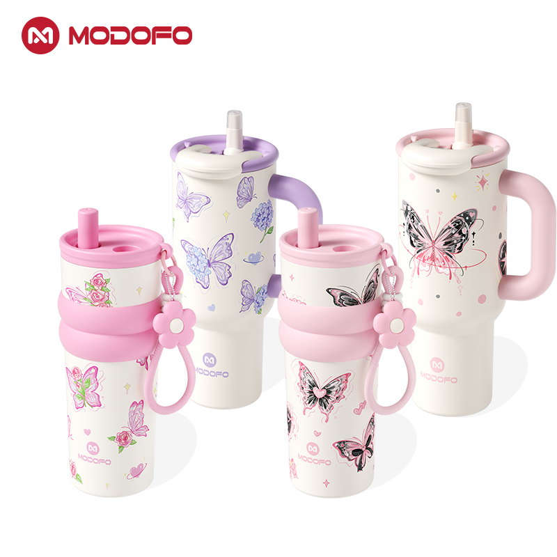
A reusable bottle that looks equally at home in a quiet kitchen, a modern workspace, a neighborhood café, or an outdoor adventure.
A tumbler that complements morning coffee as easily as weekend travel.
Thoughtfully chosen colors help everyday essentials feel familiar across different moments and different places.
Rather than following short-lived trends, we believe timeless color creates products people continue enjoying year after year.
Because great design should never compete with life.
It should quietly become part of it.
Conclusion: The Best Colors Help Everyday Life Feel Natural
Color is one of the quietest forms of design.
We rarely stop to think about it.
Yet it shapes countless decisions every single day.
The café where we choose to sit.
The notebook we reach for.
The bottle we carry.
The kitchen where we enjoy cooking.
The workspace where ideas begin.
Good color does not need to be loud.
It does not need to become the center of attention.
Its greatest success is helping ordinary moments feel more comfortable, more welcoming, and more effortless.
Because before we ever experience a product, a room, or a place—
we experience its color.
And sometimes, that first impression quietly becomes the beginning of a better everyday life.
Before we touch an object, we experience its color—and that first impression often shapes everything that follows.